Week 9

In week 2 of this project we got into groups again to discuss our ideas we had to bring our drawings in and talk about our ideas. The group suggested I do like food porn and showed me images of what that was or that I illustrate it by drawing them step by step. Then we had to bring in 3 sketches of how our poster might look. I drew up a couple of sketches which took some time as it was hard for me choose a particular layout. I used paint to draw my illustrations and I did three different layouts and drawings. I chose my title to be troubleshot I felt that this was interesting for my poster. After finishing my sketches I was satisfied and felt really good about presenting it the next class.

Week 8

For the new project in methods and processes we had to look for maps and take pictures of them over the weekend. The professor explained to us what a map was which wasn’t only countries and locations but also a menu or anything with instructions. I went over the weekend for lunch and dinner with my friends and took some pictures of menus for reference. When we went to class we had to be put into groups. Each person had the choice to choose which category they wanted I choose food because who doesn’t love food.  Since there are so many variations of amazing food it was hard to choose which food I’m going to base my poster about. When I went home I saw my brother drinking his coffee and thought why don’t I go with his unique recipe. Next class we had to discuss our ideas in groups I also talked to the professor he thought it was a weird recipe putting ice cream with coffee and he suggested I name the coffee after my brother which was never going to happen. It was between doing coffee or rice and everyone thought the coffee idea sound better so I went with that.


week 8

This is the final week before we have to submit our final A2 picture of our word. I decided to go with a white fabric as wallpaper. At first I put scissors and threw some pins around and took a couple of shots but then I felt that it was a bit plain so I put in a measuring tape. I took a couple of pictures some were good and some were blurry. I looked at the pictures and realized that the measuring tape was too eye catching because it was pink so I decided to cut off the head and keep the tape part only I took more pictures and played with the layout of the items and kept moving them to see which was better. Eventually I took about a 100 pictures and opened them on my laptop. I took out the blurry ones first then I kept eliminating ones that I felt wasn’t good enough of ones where the layout wasn’t as good. I opened it on photoshop where I edited it and turned the background white because the lighting was yellow. Then I used the healing tool because there was a red thread laying on the white fabric which I didn’t see before. Also I used the healing tool to fix the fabric as there was a huge crease going through the top. After editing it I think it looks really nice and was happy to submit this as the final.


week 7


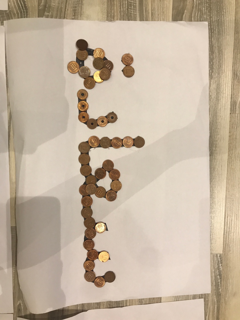
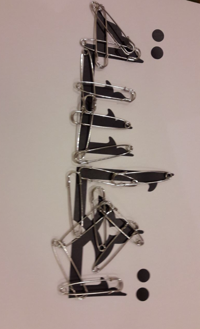
In the third week, we had the day to go and work on our projects and by the end of the class we looked at pictures of the students work that was done before us. To me some grabbed my attention they were all really nice but I especially liked the one that was done in soap. I thought this was a really interesting idea as who would ever think of using or make soap. So on Thursday we had to come in with a sample of how our final would look like.  What I had changed in mine was the way I laid out the pins so instead of laying it flat I decided to stack them on it’s side. We also had to get in groups and talk to the professor we came up with the idea of using fabric that way instead of gluing the pins I can just pin it through which was so much easier also it would look better and neater. We also said that I should choose a typeface with a curve which would make it more interesting to see how the pins would look or how they would move on the text. So I traced the word on the white fabric and started pinning them in I realized that the pins were too big and had to get medium and small sized pins for the curves and little edges. So by keep working on this I felt that I was slowly mastering how to use the pins.

For our next class I brought in my type and everyone had to critique each other’s work and give suggestions and ideas. During class we had to bring a photo of our word in a setting but I didn’t get to that since I was still pinning. The professor discussed ways on how to take better pictures and then work with lighting so I kept that in mind for the time where I would take my picture.

week 6

The following week, on Tuesday I brought in some of my experimentations I did around 5 to 7. Some I liked and some not so much. We had to get into groups and each group had to explain what they were thinking to the professor. From their I showed him my worked and he like some of the experiments I did. He joked that I could used the word قبيح and use it in a crib setting with a baby. However my sister would kill me if I did that to her son. My next word that he like was the one I used of safety pins. The safety pins I used were ones I got from saudi to use for my abayas but I thought it would be nice to use for this experiment. So after my discussion with the professor I decided to go with my idea of using safety pins. The next part of the project was mastering our item. So my doing that I had to change the layout of the pins as I just laid them on the word. The professor explain the the font or black background of the text can’t show so I had to figure out a way to use the pins in order to hide the text.
IMG_2638img_2940.jpg

week 5

During this week in type we were still working on spacing and kerning. After the professor taught us how to look at each word and identify some spacing We should fix I still found it hard and at times felt like what am I doing? Is this even right? So we had to print our words as much as we can and annotate them to bring in to class on Thursday. We also had to experiment and think about what we are going to experiment on. So on Thursday everyone brought in their work. I asked some of my classmate if I can look at their work to get inspiration or a better understanding of what to do. So that way for next week I can develop better ideas of what to experiment with.


Week 7

This is the final week to work on the project and so far I feel like my poster isn’t as close as to the final as I wanted to be. I decided to scan some of my 100 things and incorporate more of it in my poster. So I created a background for my poster which is a block of wood. So I also decided to change my quote and use a quote from the Quran. I put a white box and inserted the text in it. After that we had to bring it to class printed as a2 and tile it. We had the hatred critique and some people mentioned that I should add more of my 100 things to it as well as many said that its too centered. Also that it looked like a page from an arabic book which is not good in this case. After that I scanned some leaves and added it to my final poster I cut out my tree from my scan and used the idea of repetition and moved it around so it wouldn’t be centered. I also played with transperancy and color to make my poster look better. Looking at my final I was pleased with the result. I think its not too simple and not too crowded and it was definitely more organized.

Week 6

In week 6, I came in with my first sketch i decided to go with my initial idea which was putting in a piece of wood as the background and using the quote I found last week and which was “kill the humans and save the trees” We had to print it out in a3 and hang it in class after putting it up i felt that mine was too simple and plain compared to everyone else. So for my next attempt on creating my poster I decided to add more object and more text to make my message more clear. So by doing that I added a title which is go green and added a symbol of recycling as well as an outline of a tree thats just green and another tree which has no leaves and is just plain. I still used wood in the background and played with transparency. However when we printed it and hanged it on the wall I still felt like mine wasn’t good enough. While looking at it I realized that I had just stacked things on top of each other and it felt too crowded. For my next step i decided to go with Fatima’s advice and use more of my hand work since I better with craft rather than just using illustrator. go green

Week 5

Starting the third project in M+P, the class discussed posters that were hung on the wall and we talked about which ones were good and which ones needed improvements, we suggested changing some things to help make the poster better. For our posters we had to refer back to our 100 things and incorporate it in our poster. My object was wood therefore I felt like I could link it to a bigger message about saving trees and how a lot of paper cut up wood and waste it. For the following class we had to bring a couple of sketches to class, in class we had to get in groups and discuss our ideas. Some students gave me ideas like creating a poster of a printer that takes in wood and comes out in paper which shows in my first sketch. My other sketches show a person cutting up trees then making like a chair and other things made from wood. My third idea it is a group of people who use wood to start a fire to keep themselves warm. I felt that I got more ideas after I discussed my initial idea with the group which will help me develop my first sketch for the next class.

Type – Week 2

By the end of week 1 we were assigned another 30 of the type to make. However before that during class we had to print our first 30 and stick them up in the class, I saw that most people were having the same problems as I did. We discussed how to fix some problems that most people were facing and that gave me a bit more insight on how to do my next batch of types. For the first 30 what I was doing wrong is that i wouldn’t go outside the 20 by 20 box which made it difficult to have a 50, 50 percent balance. Also most of the letters I used had thin lines which also made it hard to cover the box in 50 percent black colour. So after this i decided to do things differently by researching the fonts or typing each letter on a different page to see which ones had a unique shape and had thick lines. Also I tried to use more bold letters to fit in the page which helped me  cover more black than I did the first time. Also I used the create outline feature which helped me resize the letters to try and make it 50 50. Also another change was going outside the box which I didn’t know how to do the first time. By the second discussion of our types I was a lot more confident in presenting my work however there were still some problems which had to be fixed for my final pieces, but by know what helped was I understood how to create better types. What helped me the most was the discussions and hanging my work up because once it was on paper it look a lot different than how it was on the laptop. Also talking about what was wrong and how to fix it in class with the professor and my classmates help me with the issues I was facing.